NOAA
There are several other websites I stumbled upon in my search for similar pages. Most of these however, are bland, consisting of a bunch of text with some images put in between. A good example of this is the National Oceanic and Atmospheric Administration (NOAA)’s ocean service page on kelp forests. It is a short page, with text content, a title and a single image, very fitting of a blog post for this class.
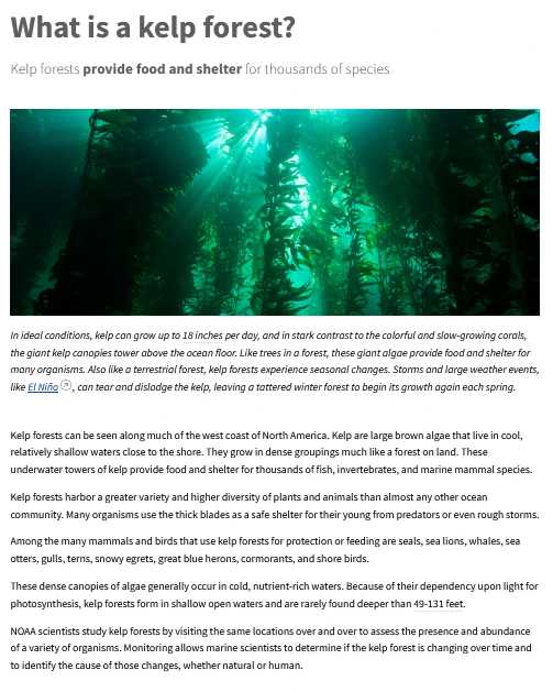
A minimalistic webpage with a text section and single image.
(Design by the National Oceanic and Atmospheric Administration (NOAA))
Monterey Bay Aquarium
While most are quite simplistic, and minimal, a good example of an inspiring webpage would be the Monterey Bay Aquarium’s website. This website uses plenty of visually interesting formatting with asides and great use of images. Below is an image showing their use of different containers to break up the flow of information.
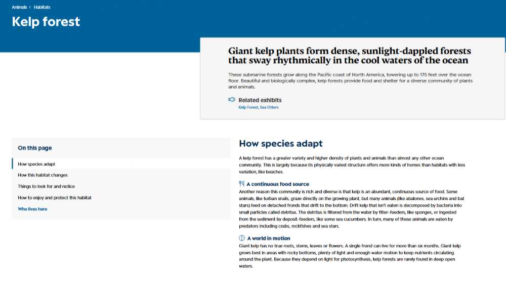
The Monterey Bay Aquarium's website featuring different sections for seperated content.
(Design by the Monterey Bay Aquarium)
Here is another example of this webpage’s use of formatting, using a grid of images to showcase the variety of fauna present in the ecosystem. This creates a great visualization element so that viewers can get a sense of the types of organisms present.
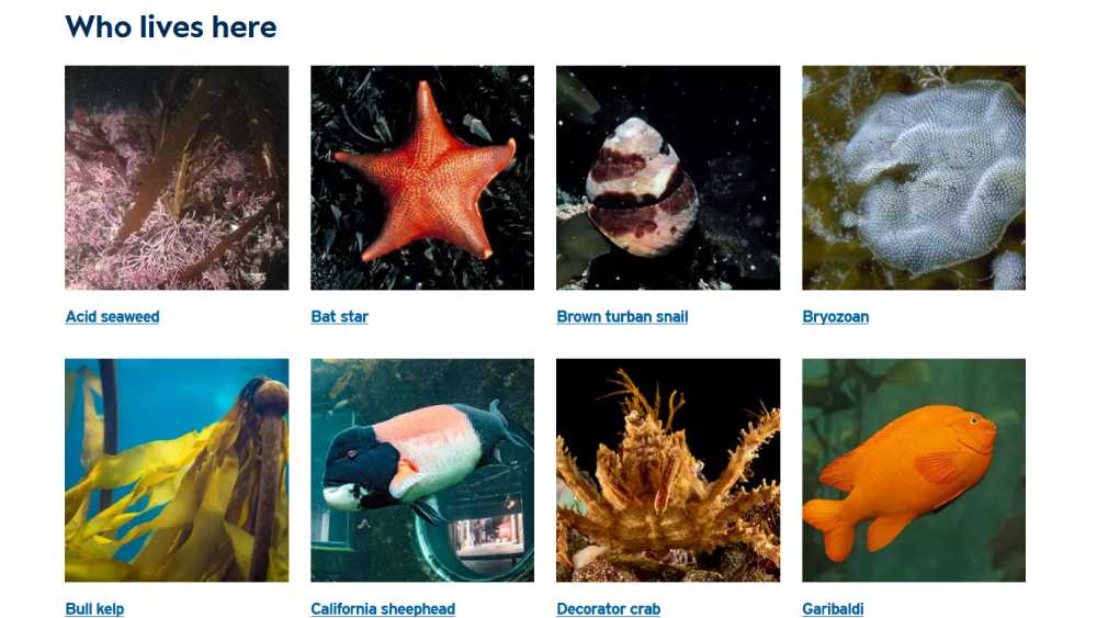
The Monterey Bay Aquarium's website showing a grid of images of marine organisms accompanied by their names as links that a user can follow.
(Design by the Monterey Bay Aquarium)
Francesca Mills
The final example I liked was the website https://storymaps.arcgis.com/stories/6341e2d5a9224ce98caf93b946fe8356. This webpage uses a consistent fourth of the screen on the side along with large images in order to highlight visual content when the text is more secondary.
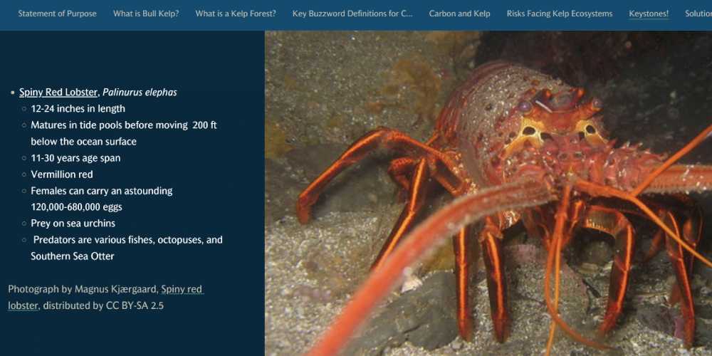
The website's text section on the left and large iamge on the right.
(Design by Francesca Mills)
Overall there are a few websites out there doing similar things to my proposal. However I think what I can bring to my design is a more creative and visually interesting design instead of the formal text based designs I have shown.