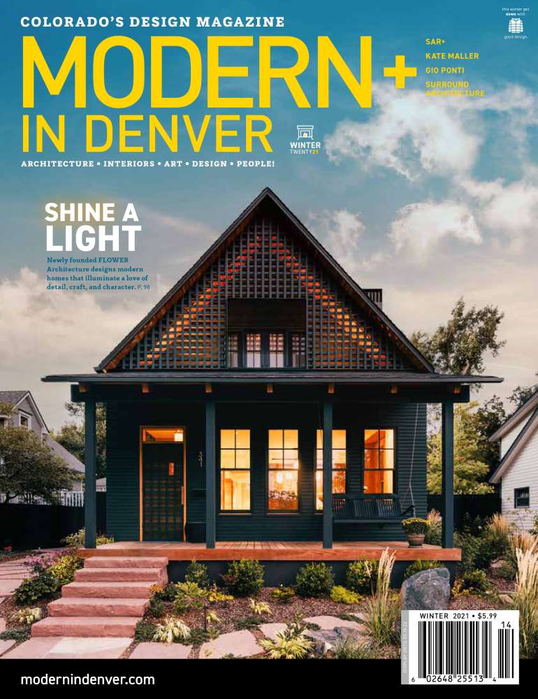
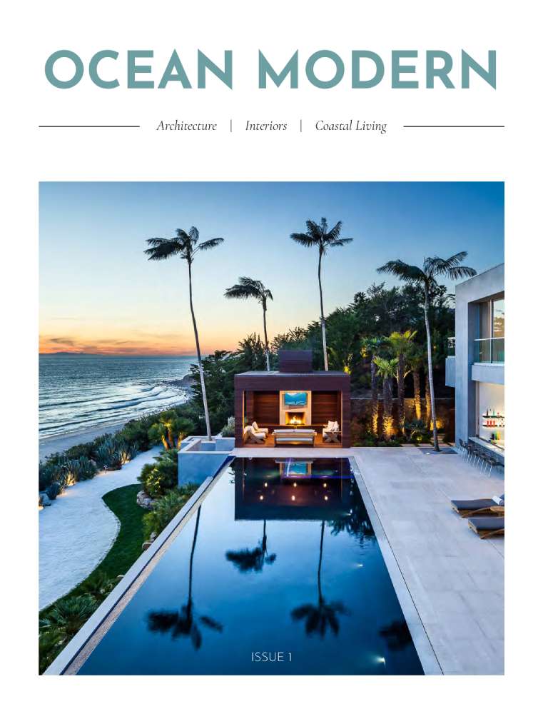
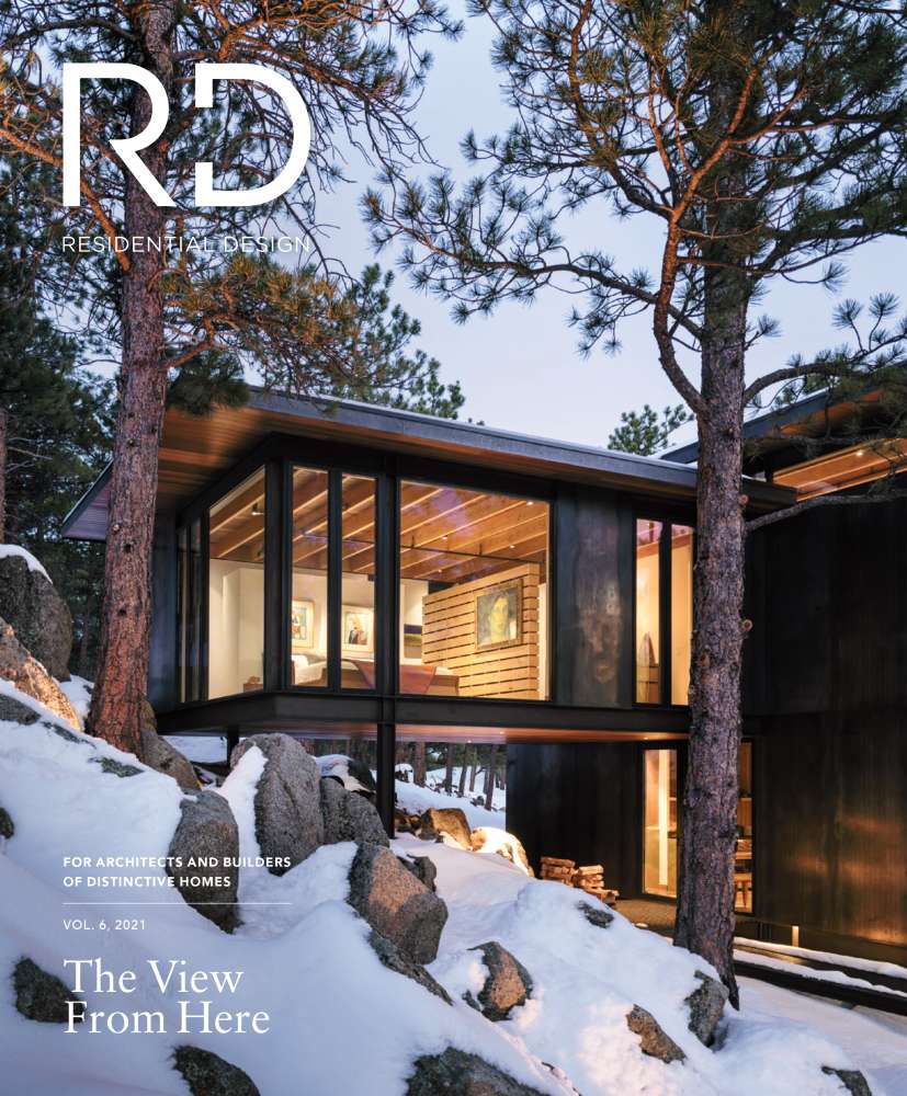
The layout that these covers use are very consistent. The title is always on the top, often in one of the corners (although for Ocean Modern it is centered). Occasionally there will be a barcode in one of the bottom corners. Any additional content will be in one of the corners, either at the top with the title, or at the bottom establishing balance. All of the rest of the space is left as negative space.
There is a clear set of rules for the typography in these covers and it is clear. The main content is given a ‘standard’ style, in these examples they are all given a small, greyscale, serif typeface.
The rest of the type (titles, subtitles, authors, blurbs, publication information etc.) are all set in a sans serif typeface. Often these typefaces are also set in a higher weight than the main content. These pieces of type are often greyscale as well, although in Modern in Denver and Ocean Modern the titles–and some miscellaneous information–are given a contrasting color to draw a viewer's eye.
These covers consist of three primary things. Text, Images, and other graphic forms (shapes, lines etc.). Some of the keywords used frequently are modern, design, architecture, interiors, home/residential. The images used are all exterior shots of residences. All of them contain softer lighting (as if near sunset), each cover is centered on some sort of opening in the building (door, window, etc.), and each of them is brightly lit from inside. The images featured are all also modern architectural styles. Other graphic elements used are used minimally and to support the other pieces (dividers, barcodes, etc.).