Layout
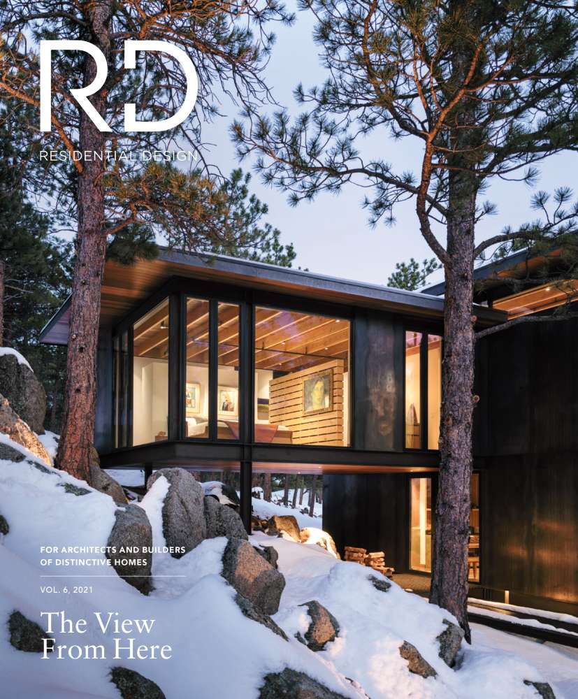
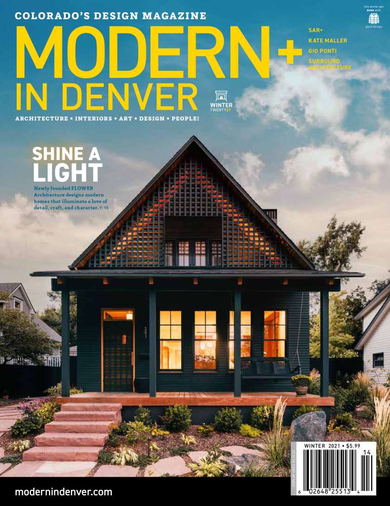
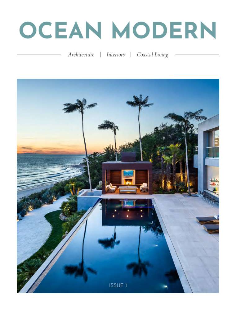
These magazine covers used large amounts of negative space to draw the viewer's attention to the architecture featured. The placement of the elements near the edges–primarily the top and the bottom–draws your eye to the center, where the home is focused.
-
-
-
-
-
-
-
-
-
-
-
-
-
-
-
-
-
-
Typography
The use of serif typefaces is meant to invoke a sense of formality, as they are styled after traditional styles of writing. This This choice in typefaces represents an intentional appeal to ethos. Serif fonts, in evoking older styles of writing such as those used to write greek and latin, situate themselves alongside these styles. In doing so they establish a certain sense of authority and formality that does not inherently come with the use of sans-serif typefaces. Ethos–defined in Writer/Designer–is:
“In all rhetorical situations, authors need to consider how best to build their credibility so that audiences trust their knowledge and character. This credibility is called ethos.” (Ball et al. 149)
One major principle of design is emphasis. In Writer/Designer emphasis is described through the lens of analysis,
“When analyzing an image for emphasis, we pay attention to what we notice first and then ask ourselves why…Where is your attention drawn visually?” (Ball et al. 44)
The type accomplishes this through both size and color. In creating emphasis with size, the covers use the major design principle of the Gestalt principle of similarity. As described in The Practical Guide to Information Design,
“In much the same way, we regard elements that are obviously bigger as being more important, and those that are obviously smaller as less important. In fact, size is the most notable graphic trait.” (Lipton 17)
As you can probably infer, this is why the titles and article titles are given such a large weight. With this size they are able to establish themself within the hierarchy as the most important pieces of information. The type also utilizes color to create emphasis through the Gestalt principle of figure/ground to establish contrast. The Practical Guide to Information Design describes this principle as:
“[Making] the content prominently emerge from (contrast with) its background” (Lipton 19)
Two of my three samples do a great job of this. Both Ocean Modern and Modern in Denver use size and color to contrast against the background. However in the case of Residential Design, the white color of the text blends in with the white of the snowy background.
-
-
-
-
-
-
-
-
-
-
-
-
-
-
-
-
-
-
Content
Headings–described in Emphasizing Important Information–
“create a hierarchy of information, dividing the document into major sections and subdividing those sections into subsections.” (Markel and Selber 194)
With this definition in mind, we can see this at work in our samples. The titles are always the highest in the hierarchy, and the right under that there are always headings related to the interior contents (“Shine a Light” for Modern in Denver, “The View From Here” for Residential Design) Another thing the content does is use keywords. These keywords which I listed earlier serve to efficiently communicate the content of each magazine. ‘Interiors’ or ‘modern’ represent specific things that the magazine is about, in order to get a viewer to purchase/read them.